What the Internet looks like in 2012
2012-01-06 13:42
blah blah cloud
graph
Internet
BGP
visualization
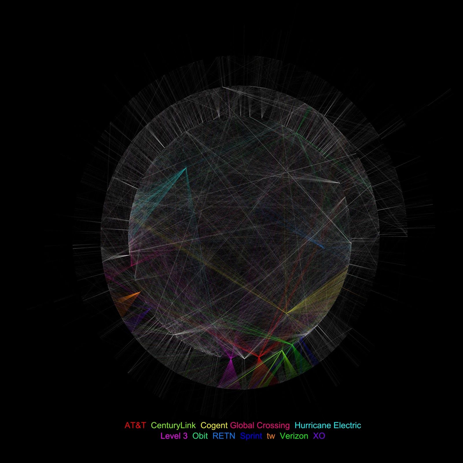
This is a graph of links between visible Autonomous Systems on the Internet generated from public BGP routing tables early on 1 Jan 2012. Each link of each AS path in the BGP data is represented as an edge, with duplicates removed. The data was then graphed using the twopi layout tool from Graphviz. Links to the top twelve most-connected service provider networks are highlighted in color, with all other AS links in white.
connection visualization of Internet Autonomous Systems
I’m struck by the sheer density of connectivity on the modern Internet. Each of the 94865 lines on this graph represents at least one physical link between organizations. But in the case of larger networks that same thin line might represent dozens of routers and 10 Gb/s fibers at many locations throughout the world.
It certainly looks as robust as originally intended, but also chaotic and disordered. Surely no government, organization, or evil genius bent on world domination could possibly control all those links. The sooner our politicians figure that out, the better.